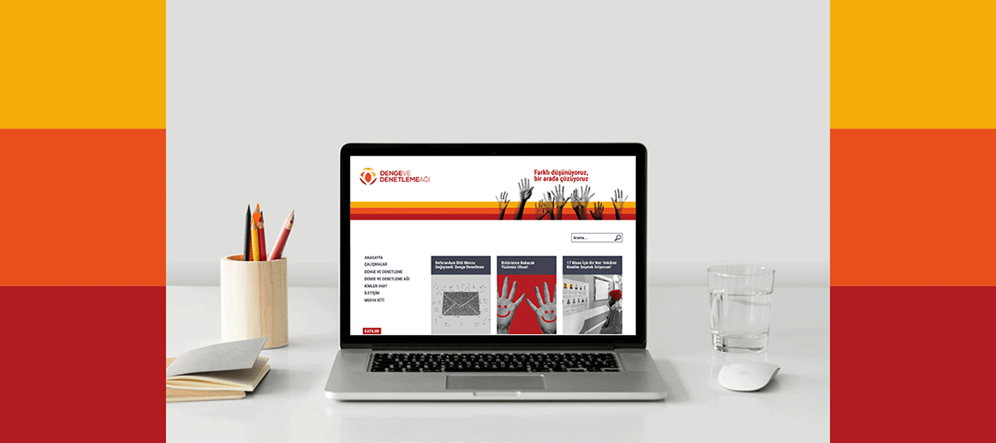
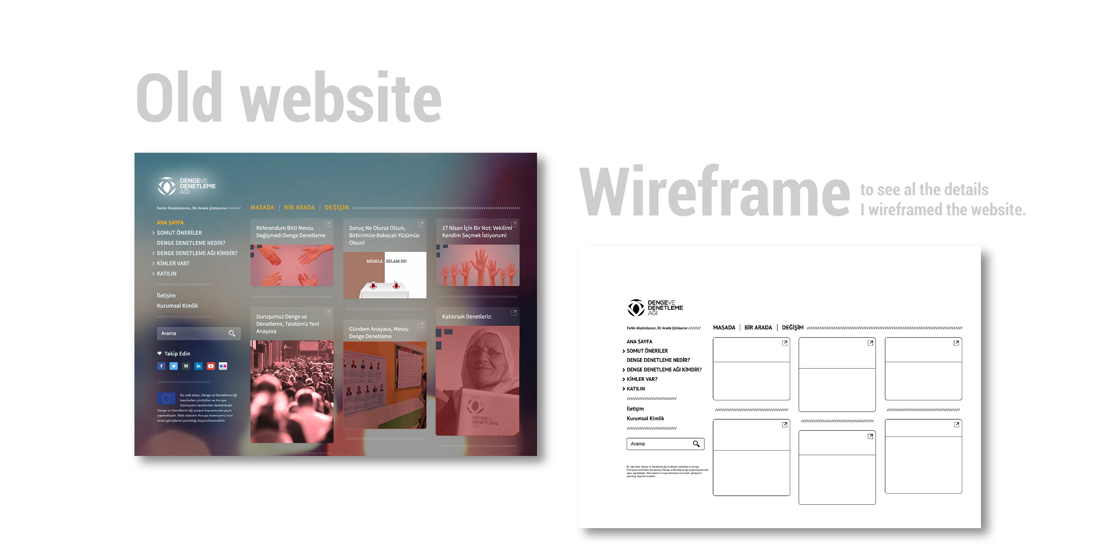
When I started to work in Checks and Balances Network as a visual director, their website was a nightmare! I offered to work with an UX lab and contacted with one; however, I have learned that they have no budget, time and energy for a totally new website. Since it was a non profit organization, the process was quite different than any other place.
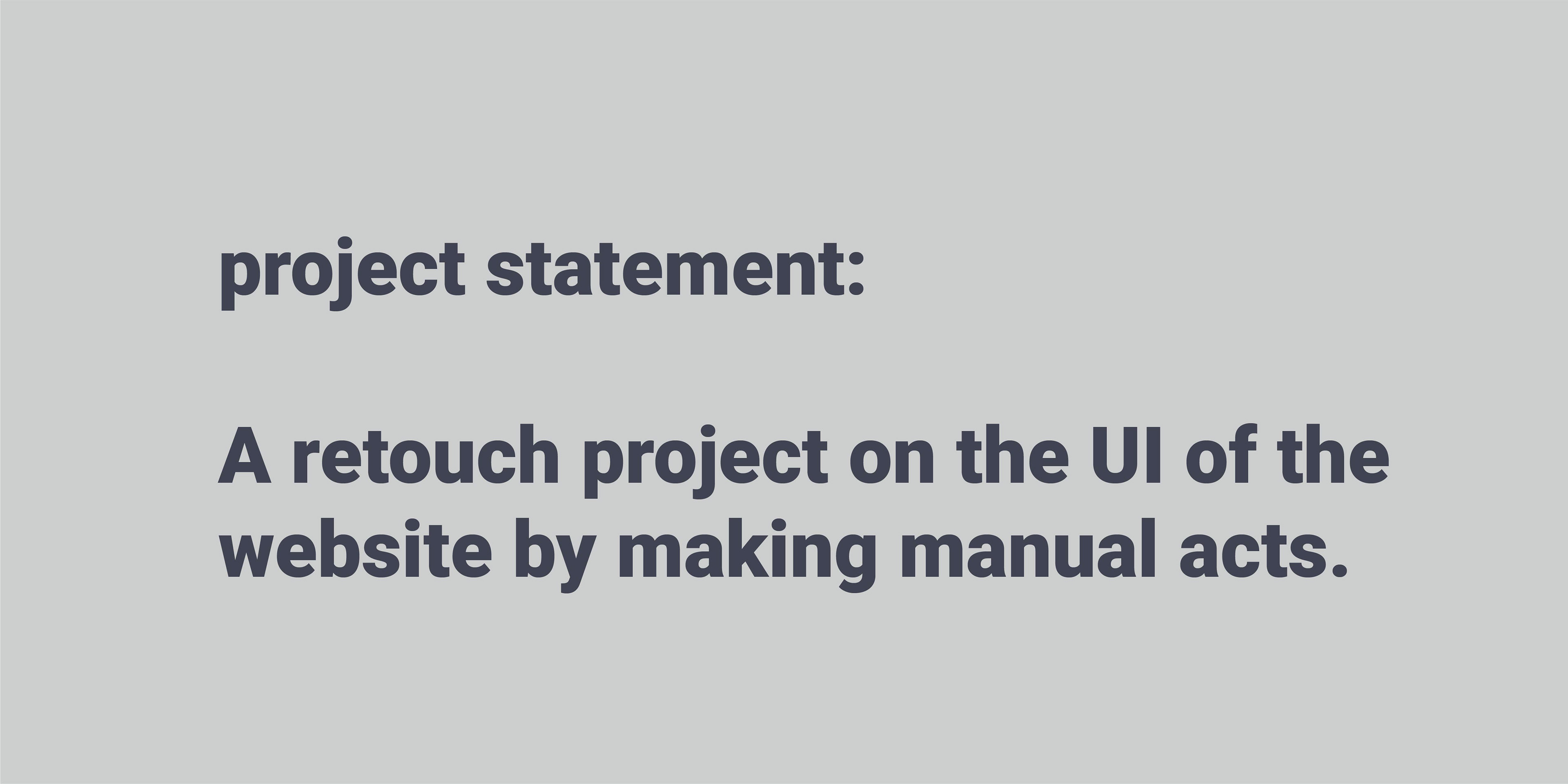
I worked on what I can do for the website as a designer. My first focus was to make the website at least have a clean UI. I focused on how to create a change and value for the organization via website.
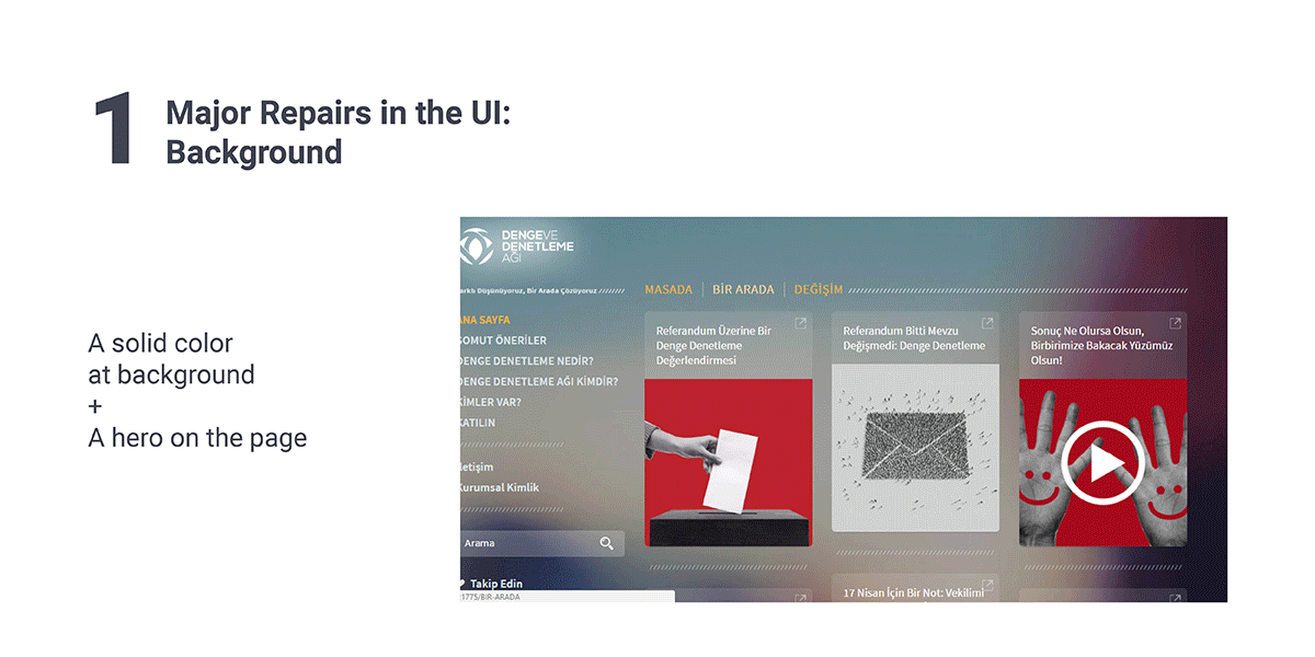
The other problem about the website was its structure. Since it was not a good designed website in terms of front end and backend, the latest digital consultant of the NGO was not eager to make any intervention to the website.
When I inspect the website, I have seen a retouch/ repair on the UI may solve some of the problems of the website. Through the process, I got the support of some people in the office and I also tried to convince some for change.
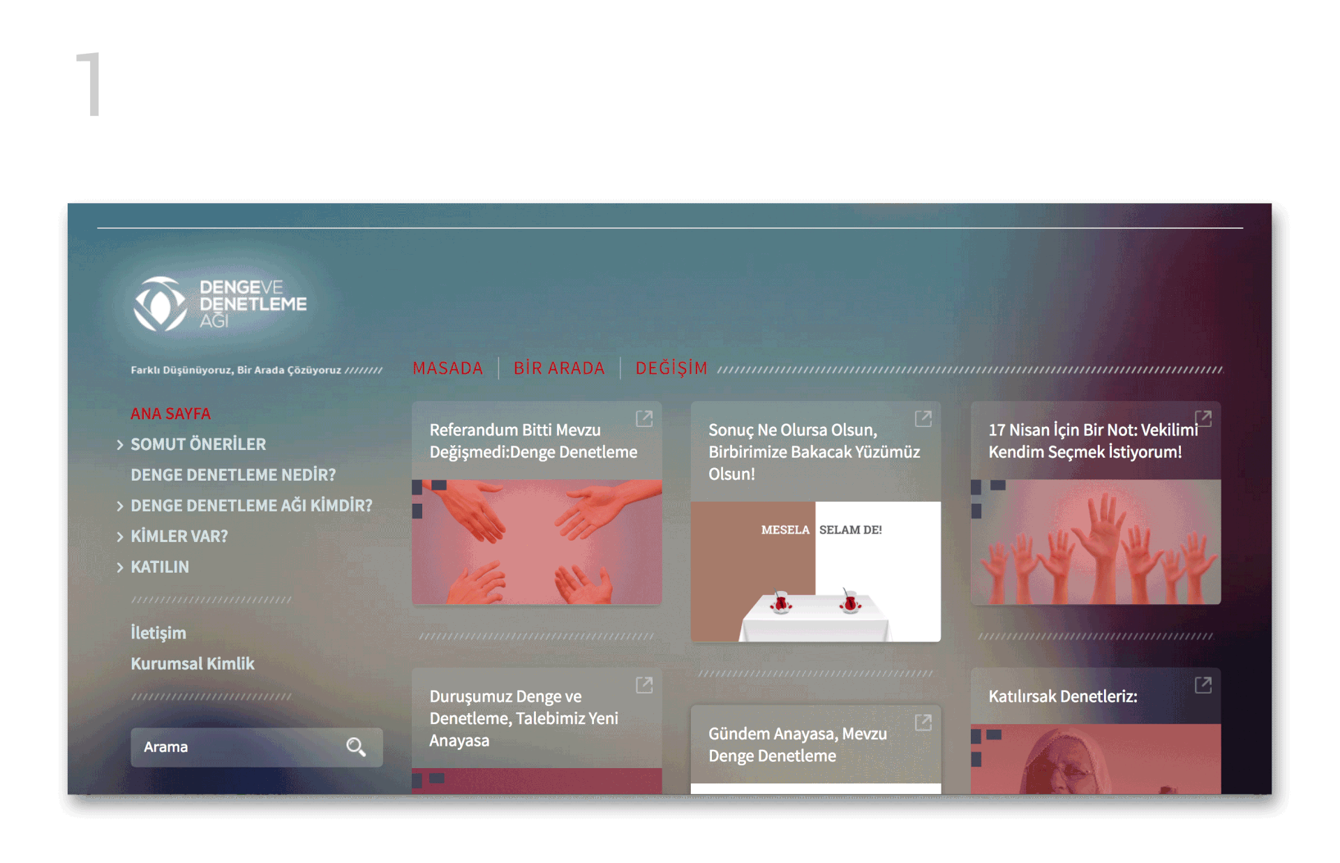
This is the process gif of my quick edits on the website. There were many unnecessary details on the website.
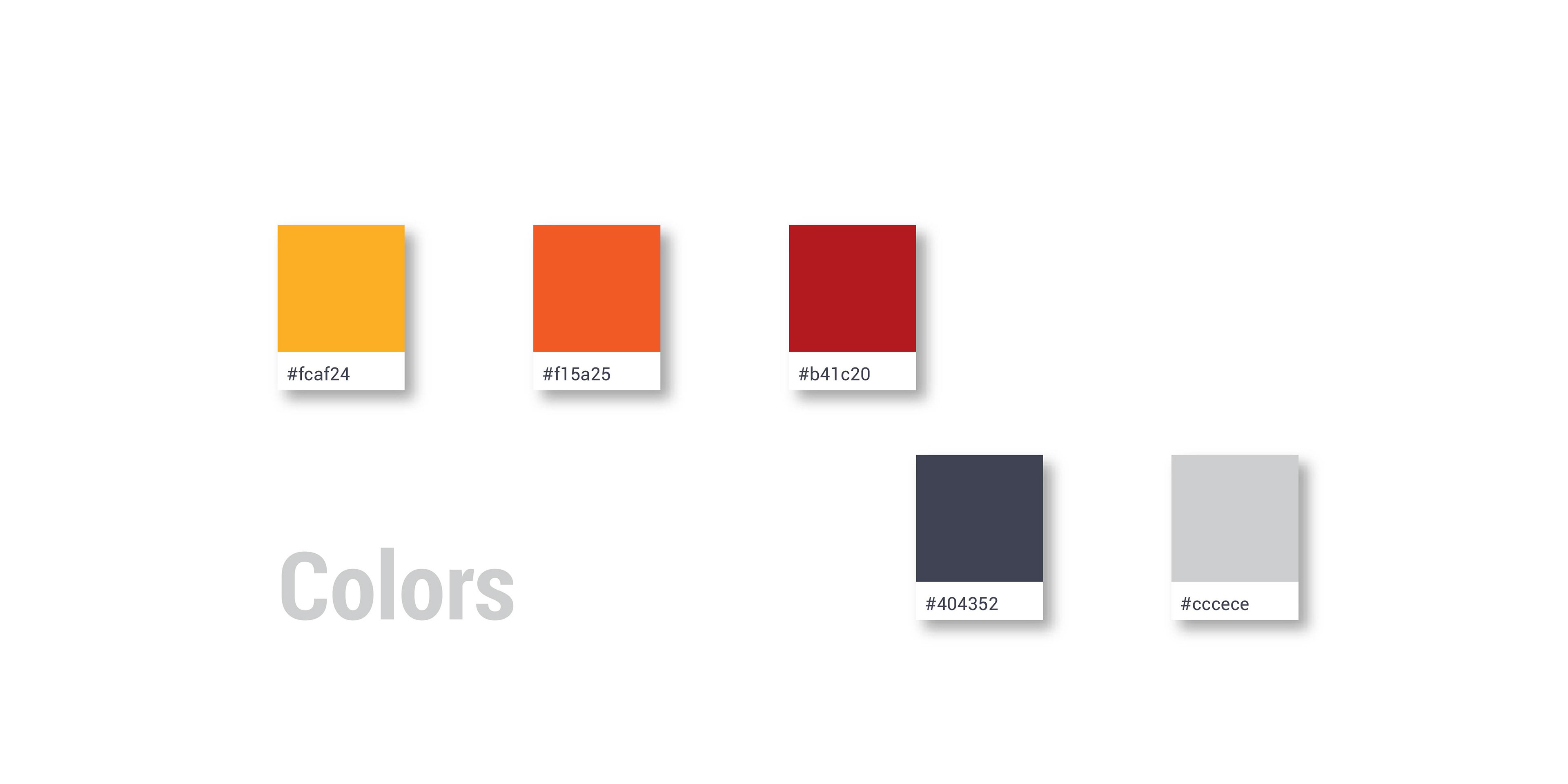
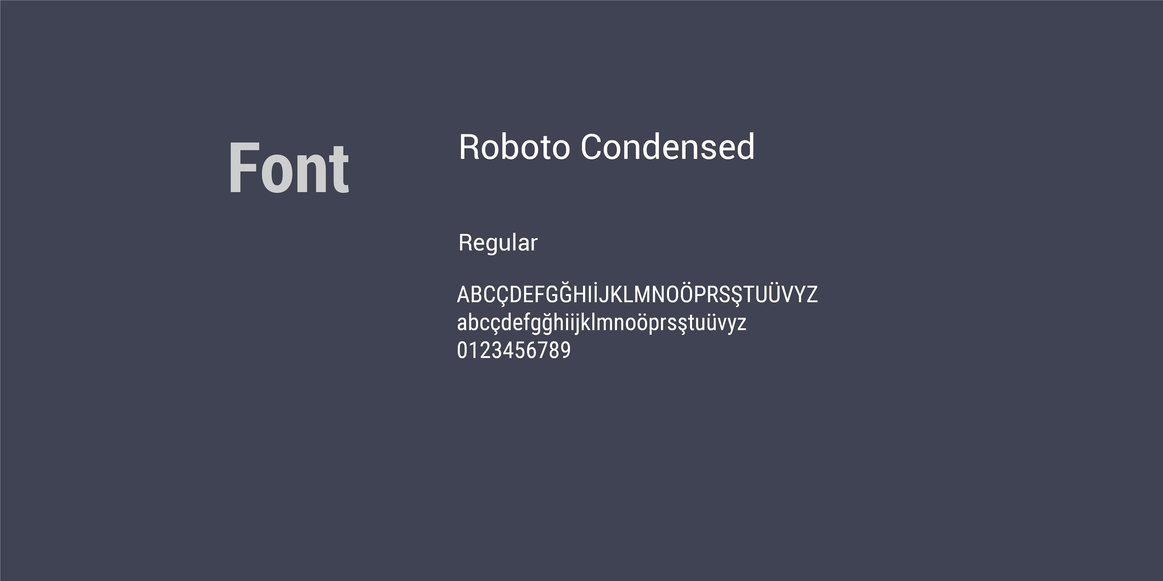
PROCESSING OF CARD VISUALS
I also developed a standard and pattern in terms of dimensions and colors for the card covers in order to provide a consistency and for the home page. Actually I did thise before the changes on UI. This worked on even that background.
This shows the process:
THE FINAL